Editing 341 photos from Montenegro in Lightroom Classic
Learning to edit RAW photos in Lightroom Classic for the first time. Profile choice, tonal adjustments, HSL, masking, preset creation, and export for CloudFront delivery.
After culling 1,668 photos down to 467, I had a clean archive ready for editing. I had never edited in Lightroom Classic before. This post documents the full process of learning to edit, building a personal preset, and exporting for web delivery.
What this post covers
First-time Lightroom Classic editing across 341 RAW images from Montenegro. Covers the Basic panel, HSL colour work, masking, preset creation, noise reduction, and export settings for CloudFront. This is a learning journal, not a Lightroom tutorial.
Starting Point
I had 467 images after culling. Before editing, I applied the preset I built during this process across all of them as a final quality check. Images that did not respond well to the preset got cut. That brought the total down to 341 intentional keeps.
From those 341:
| Collection | Count | Purpose |
|---|---|---|
| Montenegro Gallery | 26 | Images that stand alone visually |
| Montenegro Journal | 17 | Images that support narrative |
| Archive | 298 | Memory and future resource |
The gallery and journal images got full individual edits. The archive keeps the preset as a base.
The Result
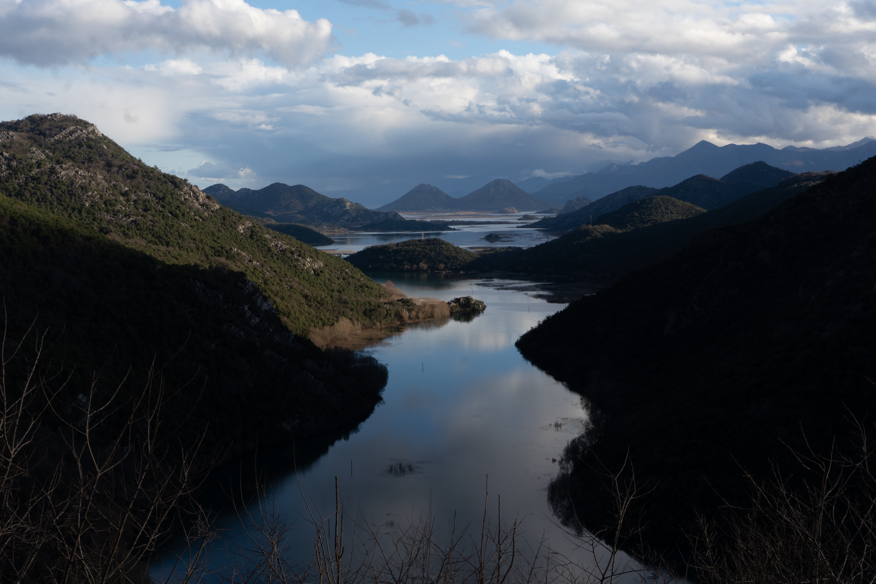 Before — straight from camera
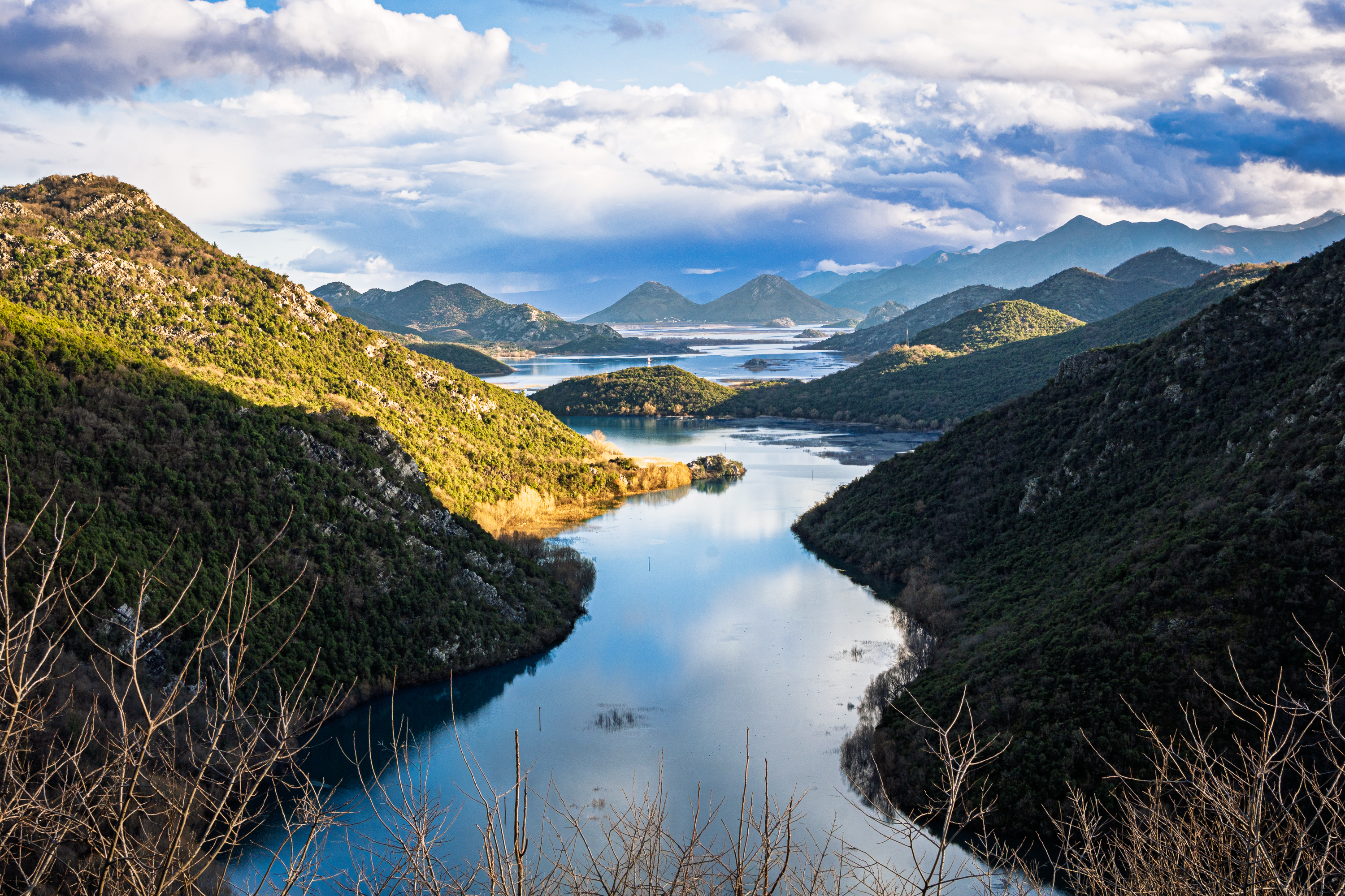 After — full edit
The Test Group
Before editing all 341, I picked 5 images that represented different conditions. I tagged them with red colour labels in Lightroom to isolate the group.
| Image | Subject | ISO | Focal Length | Challenge |
|---|---|---|---|---|
| 1 | Scenic town, green water | 50 | 19mm | Clean file, full tonal range |
| 2 | Monastery in fog | 100 | 18mm | Bright fog, limited sky |
| 3 | Mountain road with yellow markings | 100 | 70mm | Fog over mountains, highlight clipping |
| 4 | Indoor gym from balcony | 1250 | 28mm | Low light, noise, artificial lighting |
| 5 | Sunset, man on boat | 800 | 30mm | Dark exposure, warm light, action |
The idea was to learn on these five, build a preset from the first edit, then test it across the others. Every technique I learned got applied across different conditions to see how the same adjustment behaves differently depending on the image.
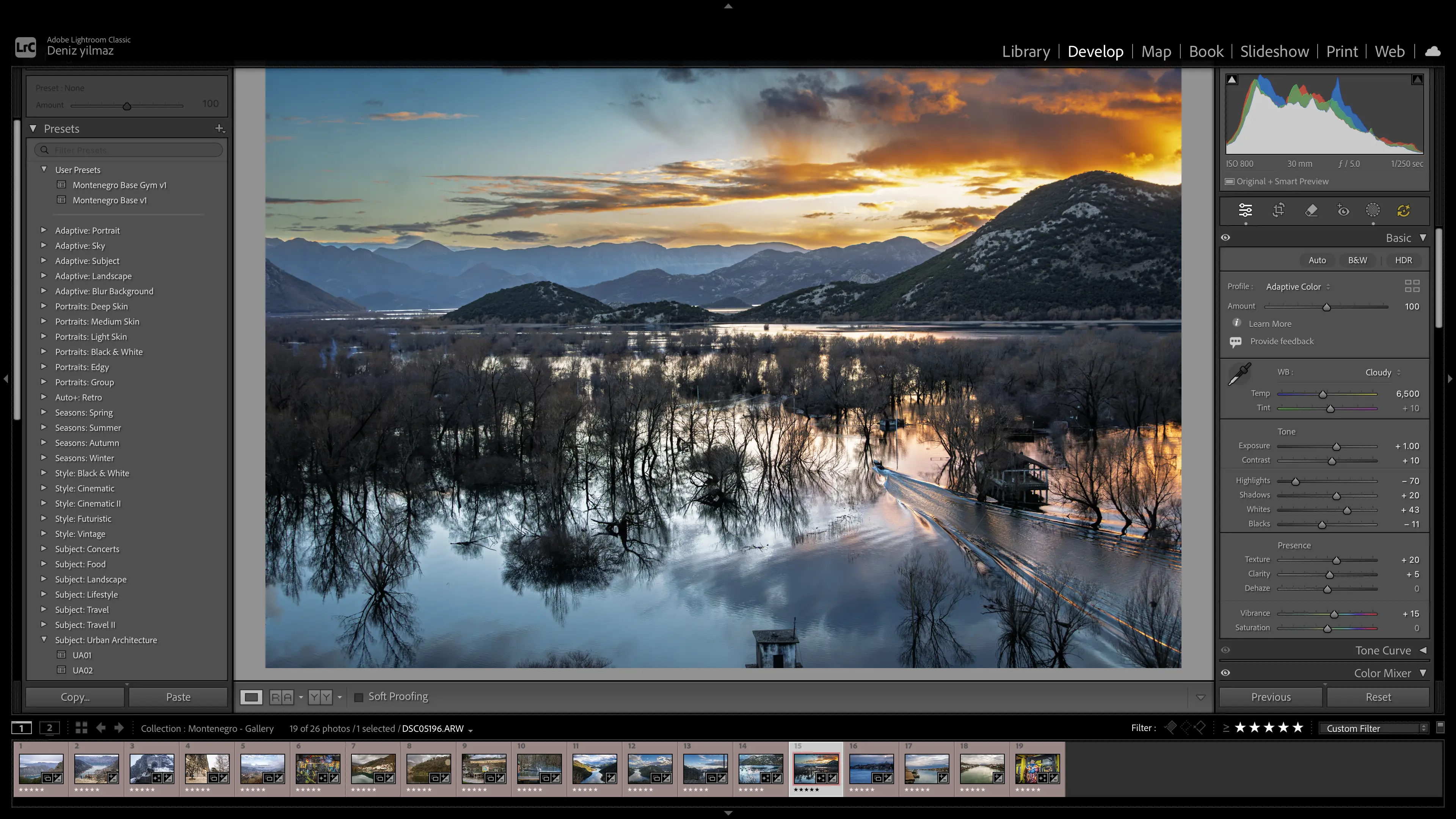
Step 1: Profile
Before touching any sliders, I chose Adaptive Color at 100 as the profile. This is not a preset. It is the foundation that determines how the RAW data is interpreted. Adobe recommends applying it before other adjustments because changing profiles after editing shifts the foundation underneath your work.
I left it at 100. The slider goes to 200 but 100 is the intended strength. If the image still feels flat after all edits, bumping to 120 or 130 is an option. That is a decision for the end, not the beginning.
Do not combine Adaptive Color with Auto.
Adobe says this directly. Pick one approach.
Step 2: White Balance
White balance controls colour temperature. It determines whether the photo looks warm or cool.
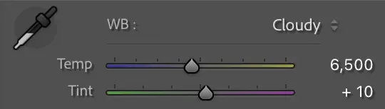
Temp moves between blue (cool) on the left and yellow (warm) on the right. Tint moves between green on the left and magenta on the right.
I started by trying the eyedropper on a neutral grey surface. The camera shot at 5,850K. The eyedropper corrected to 5,500K. The difference was subtle, 350K cooler and 6 points less magenta on the tint.
I then tried the white balance presets. Cloudy at 6,500K gave the image a warmer, slightly vintage feel. I liked it and went with it.
Questions I ask when setting white balance:
What was the light actually like? Direct sun, overcast, golden hour, shade?
Does the image feel too cool or too warm right now?
What mood do I want? Warmer tones feel inviting and nostalgic. Cooler tones feel calm and distant.
Do neutral surfaces look neutral? Grey stone, white walls, concrete. If they have an obvious colour cast, the white balance is off.
What I discovered across the five test images:
White balance is the most scene-dependent setting. It cannot live in a preset reliably.
| Scene | White Balance | Temp |
|---|---|---|
| Overcast landscapes | Cloudy | 6,500K |
| Direct sunlight | Daylight | 5,500K |
| Indoor gym | As Shot | 4,700K |
| Sunset | Cloudy | 6,500K |
| Snow mountains | Cloudy + reduce blue saturation in HSL | 6,500K |
The preset keeps Cloudy at 6,500K as the default. Most outdoor Montenegro images responded well to it. Indoor and direct sunlight images needed changing.
Step 3: Tone
This is where the histogram matters. The histogram shows the tonal distribution of the image. Left is shadows, right is highlights, middle is midtones.
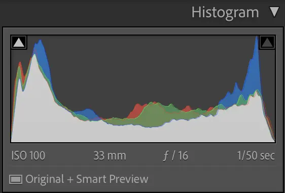
The triangles in the top corners are clipping indicators. These became essential throughout the editing process.
| Triangle colour | What is clipping |
|---|---|
| Blue | Blue channel only |
| Red | Red channel only |
| Green | Green channel only |
| Pink/magenta | Red + blue channels |
| Yellow | Red + green channels |
| Cyan | Green + blue channels |
| White | All three channels, no recoverable data |
One colour is a warning. Two colours means back off. White means you have gone too far.
Exposure
Controls overall brightness. I used the histogram to check for clipping but made the decision by eye. My first image only needed +0.10. The camera exposed well at ISO 50. Not every image needs exposure correction.
Across the test images, exposure varied the most:
| Image | Exposure | Why |
|---|---|---|
| Scenic town | +0.10 | Well exposed in camera |
| Monastery | Preset value | Fog was intentionally bright |
| Mountain road | -0.30 | Preset pushed already bright image into clipping |
| Indoor gym | +1.00 | Dark scene, camera struggled for light |
| Sunset boat | +0.50 | Dark scene, needed lifting without killing mood |
Highlights and Shadows
Highlights control bright areas. Shadows control dark areas. Most landscape photos benefit from pulling highlights left and pushing shadows right because cameras capture high contrast scenes poorly compared to what your eyes see.
I went with highlights -70 and shadows +20 on the first image. The trap to avoid is pushing both to extremes. Highlights all the way left and shadows all the way right makes the image look flat.
What does flat mean?
Not enough difference between light and dark areas. Everything sits in the middle of the tonal range. Nothing is truly bright, nothing is truly dark. It looks dull.
Whites and Blacks
These set the upper ceiling and lower floor of the tonal range. After pulling highlights and pushing shadows, the tonal range can compress. Whites and blacks stretch the endpoints back out.
The Alt/Option drag method:
Hold Option while dragging Whites right. The screen goes black. Coloured pixels appear as you approach clipping. Stop just before they appear. Same process for Blacks in the opposite direction.
I landed on whites +43 and blacks -11 on the first image, then checked the clipping triangles. Both lit up blue. I pulled back to whites +43 and blacks -11 where the triangles settled. On other images these values changed significantly. The mountain road needed whites at +20. The gym needed blacks at +10.
Contrast
The contrast slider applies a broad S-curve. After building contrast manually with whites and blacks, the slider needs a light touch. I pushed to +10 on the first image. Higher values triggered additional channel clipping because the whites and blacks had already used most of the available headroom.
Step 4: Presence
| Slider | What it does | My value | Notes |
|---|---|---|---|
| Texture | Enhances fine surface detail | +20 | Grain in stone, cloud texture, foliage |
| Clarity | Adds midtone contrast | +5 | Could not push higher without clipping |
| Dehaze | Cuts atmospheric haze | 0 | Caused shadow clipping on first image |
| Vibrance | Boosts muted colours, protects strong ones | +15 | Safer than saturation for colour |
| Saturation | Boosts all colours equally | 0 | Even +1 triggered pink clipping |
Important lesson:
When checking clipping during presence adjustments, I had to establish a baseline first. The blue triangle was already lit from the tonal work. So the real question for each presence slider was not “does it cause clipping” but “does it change the triangle from blue to pink.” Blue was already there. Pink was the actual limit.
Step 5: HSL Colour Work
HSL stands for Hue, Saturation, and Luminance. Each colour in the image is independently controllable across these three properties.
Hue shifts a colour towards its neighbours. Push blue towards cyan and the sky looks more teal.
Saturation controls how vivid the colour is.
Luminance controls how bright or dark a colour is.
I started by only using saturation. That is one third of HSL. The real discovery was luminance. Pulling luminance down on a colour makes it richer and deeper without making it more vivid. The two together are more powerful than either alone.
Practical habit: Every time I push saturation on a colour, I also try pulling luminance down slightly on the same colour.
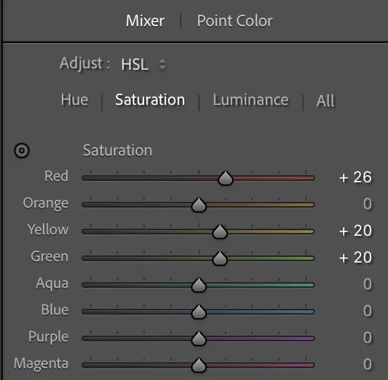
First image (scenic town)
| Colour | Adjustment | Value | Effect |
|---|---|---|---|
| Green | Hue | +25 | Shifted water towards aqua/teal |
| Green | Saturation | +10 | Made water more vivid |
| Orange | Saturation | +20 | Made warm trees more vivid |
| Yellow | Luminance | +10 | Brightened creamy buildings |
What I learned across all images
HSL is always per-image. The dominant colours change with every scene. But some patterns emerged:
| Scene type | Colours to adjust |
|---|---|
| Coastal/water | Aqua, blue, green |
| Warm buildings | Orange, yellow |
| Sunset | Orange, blue, aqua |
| Foliage | Green, yellow (dark foliage often sits in yellow) |
| Snow | Blue saturation down to reduce cold cast |
Red saturation indoors:
On the gym image I pushed red saturation to boost equipment colour. At +30 the skin tones on two people in the frame started looking sunburnt. Pulled back to +20. Red saturation on indoor images with people has a lower ceiling than outdoor images without people.
Yellow saturation at 100:
On the mountain road image, the yellow road markings were the subject. At 100 saturation only the road and surrounding rocks were affected because the image had no other yellow. Context decides the value, not a rule about what number is too high.
Step 6: Masking
Masking lets you edit specific areas of the image independently. Global adjustments in the Basic panel affect everything. Masks target just the sky, just a subject, or just an area you paint.
Sky Mask
For most overcast skies, I used a simple combination:
| Adjustment | Value |
|---|---|
| Exposure | -0.15 |
| Dehaze | +10 |
That took flat skies from “nothing” to “something” without being dramatic. On the first image I tried -0.4 exposure and +20 dehaze. It looked dark and stormy but made the image feel gloomy, fighting against the warm edit I had built. I pulled back until the sky had presence without overpowering the warmth.
The sky should support the image, not dominate it.
Find the point where it stops looking dull but does not start looking threatening.
Not every image needed a sky mask. If the sky was a tiny strip at the top or the image did not suffer from a flat sky, I skipped it.
Linear Gradient
On the mountain road image, the fog was on the mountains, not in the sky. The Sky mask could not select it. I used a Linear Gradient instead, dragging from the top downward over the foggy area. Dehaze and clarity within the gradient brought out texture in the mountains without affecting the road below.
Subject Mask
On a portrait of me chopping wood, the warm preset made the forest background look good but my skin looked like a filter. I created a Subject mask (Lightroom detected me automatically), pulled Temp left by -10 to -15 within the mask, and reduced saturation by -10. The forest stayed warm, my skin looked natural.
Brush Mask
On the monastery image, a woman was holding a red bag in the background. I painted a brush mask over just the bag and pushed saturation up to make it pop. Masking does not have HSL. It has a single saturation slider that boosts all colours in the masked area, but since the mask isolated just the bag, only the red was affected.
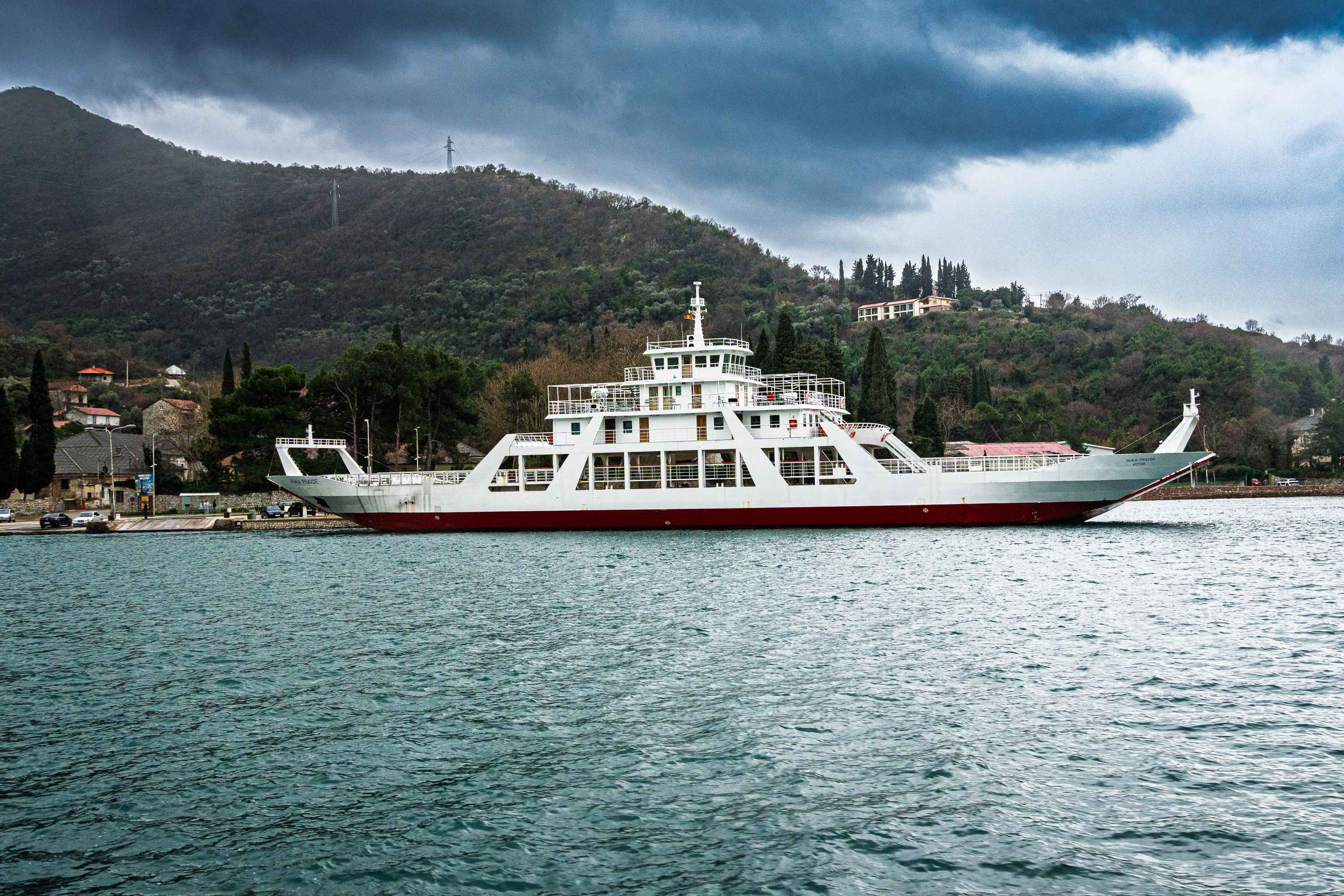 Manastir Ostrog
Step 7: Detail and Noise
Sharpening
Lightroom applies default sharpening to every RAW file: Amount 40, Radius 1.0, Detail 25. I pushed Amount to 55 and added Masking at 40.
The Masking slider is the most useful one. Hold Option and drag right. White areas get sharpened, black areas are protected. I set it so the sky went black and the edges of buildings and trees stayed white. Sharpening is only visible at 100% zoom.
Denoise
At ISO 50 and 100, Denoise was unnecessary. The files were clean. At ISO 1250 on the gym image, with exposure pushed to +1.0 and shadows lifted, noise was visible. I ticked the Denoise checkbox and left it at 50. It created a new DNG with the noise removed. The difference was significant.
The rough threshold is around ISO 800 and above, depending on how much you push exposure and shadows.
Step 8: Lens Corrections and Effects
Lens Corrections
Lightroom detected my Sony E 18-135mm automatically and applied the built-in profile for distortion and vignetting correction. I ticked Remove Chromatic Aberration as well. Chromatic aberration is colour fringing on high contrast edges. It costs nothing to enable and there is no reason to leave it off.
Post-Crop Vignette
I added a subtle vignette to draw the eye towards the centre.
| Setting | Value |
|---|---|
| Amount | -15 |
| Midpoint | 45 |
| Feather | 65 |
| Style | Highlight Priority |
If you can see the vignette, it is too strong. The goal is that someone looking at the image feels drawn to the centre without noticing the edges are darker.
Remove Tool
On the gym image, one overhead light was distracting. I used the Remove tool with Generative AI to paint over it. Lightroom sampled the surrounding area and replaced it cleanly. The Remove tool is for cleaning up distractions after the edit is done. It is not part of the tonal or colour workflow.
Building the Preset
After the first complete edit, I saved it as Montenegro Base v1.
What the preset includes
| Setting | Included | Why |
|---|---|---|
| White Balance | Yes | Cloudy 6,500K as default starting point |
| Basic Tone | Yes | Exposure, contrast, highlights, shadows, whites, blacks |
| Presence | Yes | Texture, clarity, vibrance, saturation |
| Lens Corrections | Yes | Profile and chromatic aberration |
| Chromatic Aberration | Yes | Always on |
| Post-Crop Vignetting | Yes | Subtle vignette |
| Process Version | Yes | Consistency |
| Calibration | Yes | Consistency |
What the preset excludes
| Setting | Excluded | Why |
|---|---|---|
| HSL / Color Mixer | Yes | Colour adjustments are image-specific |
| Masking | Yes | Sky and local adjustments vary per image |
| Sharpening | Yes | May need different values per image |
| Noise Reduction | Yes | Only needed at high ISO |
| Curve | Yes | Not used |
How the preset behaved across conditions
| Setting | Reliable across images? | Notes |
|---|---|---|
| Contrast, Presence | Yes | Personal preference, consistent |
| Vignette, Lens Corrections | Yes | Always the same |
| Highlights, Shadows | Mostly | Consistent style choice |
| White Balance | No | Indoor and direct sunlight needed different values |
| Exposure | No | Changed every image |
| Whites, Blacks | Sometimes | Depends on highlight and shadow range |
The preset is a starting point, not a finished edit. It handles style preferences but every image needs per-image decisions on exposure, colour, and local adjustments.
The Preset as a Culling Tool
After building the preset, I applied it across all remaining images as a final quality pass. Some images that survived culling did not respond well to the edit. They looked flat, the colours did not work, or the composition felt weak once the tonal adjustments revealed what was actually in the frame. I cut those, bringing the total from 467 down to 341.
Export for CloudFront
All images are served through CloudFront on photos.digitalden.cloud. Gallery and journal images use the same full size files. Display size is controlled by Chirpy width classes in the post markup.
Gallery Full Size
| Setting | Value |
|---|---|
| Format | JPEG, converted to WebP |
| Quality | 93 |
| Color Space | sRGB |
| Resize | Long Edge 3000px |
| Resolution | 72 ppi |
| Sharpen | Screen, Standard |
| Metadata | Copyright Only |
| Don’t Enlarge | Ticked |
| Naming | Custom Name - Sequence (montenegro-gallery-1) |
Gallery Thumbnails
| Setting | Value |
|---|---|
| Format | JPEG, converted to WebP |
| Quality | 75 |
| Resize | Long Edge 800px |
| Sharpen | Screen, Low |
CloudFront Structure
1
2
3
4
5
6
photos.digitalden.cloud
  → montenegro-2026
    → full
      → montenegro-gallery-1.webp
    → thumbs
      → montenegro-gallery-1.webp
Gallery images display full size on the gallery page. The same files are referenced in journal posts with Chirpy width classes controlling display size:
1
{: .w-50 .left }
Why sRGB
sRGB is the standard colour space for web. Every browser and device supports it. Wider colour spaces like Adobe RGB or ProPhoto RGB can look washed out on browsers that do not support them.
Why Copyright Only metadata
All metadata strips camera serial numbers, GPS coordinates, and camera settings. The images serve on a public website. Copyright is all anyone needs to see. Full metadata is preserved in the RAW files and Lightroom catalog.
Backup
The archive is two things: RAW files and the Lightroom catalog. The catalog stores every edit, rating, collection, and preset. Losing the catalog means losing every adjustment.
Storage Structure
1
2
3
4
5
6
7
8
9
10
11
12
NVMe Drive
  → Capture_Archive
    → 2026
      → 2026-01 Montenegro
        → Photo
          → RAW
          → Export_Web
  → Lightroom_Catalog
    → DigitalDenCloud_Lightroom_Catalog.lrcat
    → DigitalDenCloud_Lightroom_Catalog.lrcat-data
    → DigitalDenCloud_Lightroom_Catalog Previews.lrdata
    → DigitalDenCloud_Lightroom_Catalog Smart Previews.lrdata
The catalog sits alongside Capture_Archive, not inside it. One backup of the NVMe drive covers both.
Two-Location Backup
| Component | Primary | Backup |
|---|---|---|
| RAW files | NVMe SSD | Local disk or cloud |
| Lightroom catalog | NVMe SSD | Local disk (Pictures folder) |
| Previews / Smart Previews | NVMe SSD | Can be regenerated from RAWs |
| Export folders | NVMe SSD | Can be regenerated from RAWs + catalog |
Lightroom auto backup handles the catalog. In Preferences, set backup to run every time Lightroom exits, with the Pictures folder as the destination. The auto backup only covers the .lrcat file. Previews and Smart Previews can be regenerated so they are not critical.
One copy is not a backup. The NVMe drive is the working location. The local disk is the safety net.
What I Learned
| Lesson | Detail |
|---|---|
| A preset is a starting point | It handles style preferences but every image needs per-image decisions on exposure, white balance, colour, and local adjustments |
| The histogram is a tool, not a rule | Clipping indicators tell you what is happening technically. You decide whether that matters creatively |
| White balance is scene-dependent | Cloudy 6,500K for overcast outdoors. As Shot 4,700K for indoor. Daylight 5,500K for direct sun |
| Luminance is underused | Pulling luminance down on a colour gives richer, deeper results than saturation alone |
| Masking solves local problems | When a global adjustment cannot fix a specific area without affecting everything else, a mask isolates the problem |
| Denoise has a threshold | Unnecessary at ISO 50 to 100. Essential at ISO 800 and above |
| Not every slider needs to move | If the image looks right, stop. The best edits are the ones where you can explain why you moved each slider |
| Apply the preset as a final cull | Images that survive culling can still fail in editing. The preset revealed weak compositions not obvious during culling |
Quick Reference
Editing Workflow
| Step | Action |
|---|---|
| 1. Profile | Adaptive Color at 100, before any other edits |
| 2. White Balance | Set per scene. Eyedropper on neutral grey as starting point |
| 3. Exposure | Adjust by eye, check histogram for clipping |
| 4. Highlights / Shadows | Highlights left, shadows right. Do not flatten |
| 5. Whites / Blacks | Option-drag to find limits. Check triangles |
| 6. Contrast | Light touch after manual tonal work |
| 7. Presence | Texture and vibrance first. Clarity and dehaze if headroom allows |
| 8. HSL | Per-image colour work. Use luminance, not just saturation |
| 9. Masking | Sky, subject, brush, gradient. Only where needed |
| 10. Detail | Sharpening with masking. Denoise at high ISO |
| 11. Lens Corrections | Profile on, chromatic aberration on |
| 12. Effects | Subtle vignette. Remove tool for distractions |
Clipping Triangle Reference
| Colour | Channels clipping | Severity |
|---|---|---|
| Single colour (blue, red, green) | One channel | Warning, often acceptable |
| Two colours (pink, yellow, cyan) | Two channels | Back off |
| White | All three | Too far, no recoverable data |
Preset Pattern
| Transfers reliably | Needs per-image adjustment |
|---|---|
| Contrast, Presence | Exposure |
| Vignette | White Balance (indoor/outdoor) |
| Lens Corrections | Whites, Blacks |
| Chromatic Aberration | HSL |
| Masking |
Export Presets
| Preset | Long Edge | Quality | Use |
|---|---|---|---|
| Web Gallery Full | 3000px | 93 | CloudFront, full size display |
| Gallery Thumbnails | 800px | 75 | CloudFront, grid preview |
Documented February 2026.